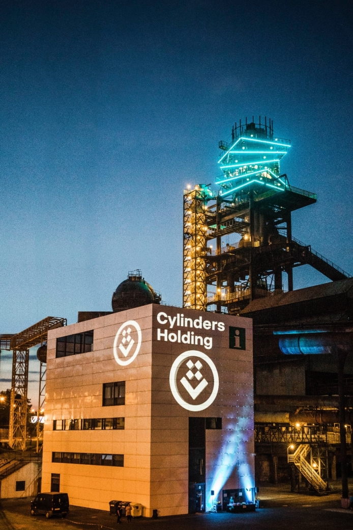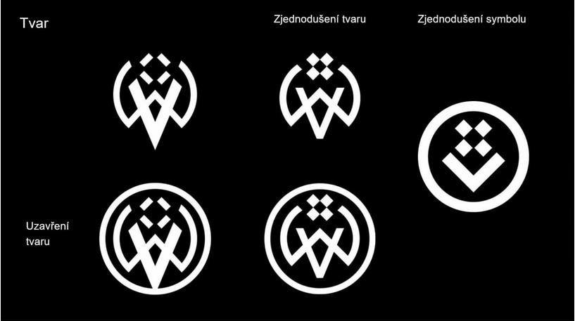
Communicative, modern, easy to reproduce, and with a completely new type of script. This is how an expert would describe the new logo of Cylinders Holding. Its authors, Aleš Najbrt, Bohumil Vašák and Ondřej Kahánek, do not themselves object to the simplification that the historical logo of 1828, which somewhat referred to the past in this millennium, turned, thanks to their work, into almost a graphical smile, which we regularly add to encouraging messages.
It is not easy to create a new logo and maintain all respect to history at the same time. In addition, everything must be internationally comprehensible and arouse emotions. A brand that arouses no emotions in anyone is no good. Being aware of the fact that Cylinders Holding separated from the original machinery brand of Vítkovice Machinery Group, top specialists of graphical studio Najbrt used the assignment above and designed a new brand to be gradually communicated to all clients of steel cylinders and vessels all over the world. “That positive emotion of a smile, which was created by opening the letter V in width and replacing the original historical W, from which we created a closed circle by clearing and simplifying the shape of the original logo, is not amiss,” says Bohumil Vašák of studio Najbrt on behalf of the authors. According to the authors of the new logo of Cylinders Holding, the original sharp shape, which reminded laymen of an old man with a beard, matched neither modern marketing, nor the grace of the products - cylinders with elegant rounded shapes and a smooth surface. Aleš Najbrt, Bohumil Vašák and Ondřej Kahánek were looking for an intersection between accurate working of cylinders, current technologies (CNG, hydrogen, etc.) and history. The result is nice and smart at the same time. In fact, the authors found inspiration in one of the cutting-edge technologies used by Cylinders Holding. Just have a look at the logo and then the innards of the forging machine, which gives the products of Cylinders Holding a competitive advantage, and everything will be clear to you. Accurate and soft treatment, perfect shaping of metal and, in addition, a smile that every customer of Cylinders Holding should keep on their face. Moreover, the authors managed to achieve a unique link: studio Najbrt chose a brand new graphical type of script for the new logo of the newly established holding. The author of that refined type of script is Tomáš Brousil, whose surname Brousil means “refined”. So, on the basis of the “nomen omen” principle, it belongs to the precision of the production of Cylinders Holding. The circle is closing. Cylinders Holding will start using the new logo officially at the beginning of June this year. The new logo well appear on products, advertising items, forms, buildings, cars and everything that Cylinders Holding presents to customers.